

City of Seattle.
Designing for the individual with the community in mind

Overview
he Project.
Working with The City of Seattle’s UX design team, we worked to create a centralized location for local information and services, so that a citizen will only need to visit the Department of Neighborhoods Resident Portal to get the information they need and have the right points of contact within the city.

T

heir Goals.
he Client.
Seattle.gov is the official city government site. It contains information regarding citizen, business, and visitor information sections, plus city government information
The City of Seattle wants to contribute to neighborhood communities by providing easier access to location-specific information, resources, and services. They want a process to engage the public in future planning and decision making and provide better access to events, resources, and services within neighborhood communities.

T
T

01
Getting Started
Our User -
Interview Overview.
The City of Seattle website has hundreds of thousands of potential users. We can’t design for everyone, so we focused our attention on our super-user, The Community Advocate, to determine the direction of our design. We interviewed 5 people who matched this persona.
Demographics.
-
3 male, 2 female
-
Age range varies
-
All involved in community outreach
-
Interact with the city website or city officials frequently
Subjects Discussed.
-
Primary concerns involving their community
-
Previous actions they’ve taken to improve their community
-
Experiences with the current city website

Our User -
Meet The Community Advocate.

The Community Advocate...
They Need...
-
Places a high emphasis on public safety issues
-
Is highly organized and driven
-
Values inclusiveness and diversity
-
Uses maps frequently in their efforts
-
To be involved in decision making processes within their community
-
The most current information on neighborhood projects
-
Opportunities to take action to improve their community
They want to know...
HOW.
WHAT.
WHEN & WHERE.
to have a voice in city/community decisions and report problems or volunteer to help
meetings/events are happening and changes that affect their community
resources/services are available to assist/benefit their neighborhood & community
Positioning -
Addressing the Competition.
I conducted comparative market research and government website competitive analysis to gain a better understanding of what already exists on the market and to see how some of the potential features were already implemented and tested through each respected site. Each of the processes focused on the implementation of GPS and map technology, as many users brought that up in the interview process.
Competitive.
Comparative.
-
Spokane
-
San Fransisco
-
New York
-
Portland
-
Eventbrite
-
Trip Advisor
-
Yelp
What we Learned.
-
Most of the city websites offered difficult to navigate information to sort through for the average user.
-
We needed to make sure our design was simple and intuitive so that anyone could get through their entire process without backing out due to an unclear steps.
-
It was important to implement interactive maps and a modular structure to our designs.


Positioning -
It's Human, Not Government.
Next we needed to layout a few key attributes for a building a successful interface that needed to be taken into account when working with local government and their constituents.
Do the right thing.
Treat Constituents as Consumers
This set the overall tone of the project: Show that the city cares about the people who seek services from the government. This involved setting clear expectations and making the process transparent.
Instead of seeing users as just taxpayers or voters, the site views them as customers that the city serves. We needed to give people a tool that’s familiar and intuitive.
Create a positive experience.
Increase Trust.
Dealing with the government can be a tremendous source of angst. We needed to make the experience of interacting with the city pain-free, simple, and, in some ways, enjoyable.
We wanted to dispel the notion that interacting with the government would be a terrible ordeal. Reversing those perceptions won’t be easy, our ideas have us moving in the right direction.


Timeline
My Role
Spring 2020
UX Research
Information Architecture
Visual Design
Team
Morgan Long
Daina Heeter
Tasha Stukes
02
Defining Goals
Define -
Creating Scenarios.
Advocates perform a wide variety of tasks on behalf of their community. Our team created user flows, task analysis, and user journeys to better understand how The Advocate would interact with out site. We pulled two scenarios from our interviews to focus on for our design.
Scenario 1: Organizing a Block Party
To organize a block party, the Community Advocate needs an easy way to view a communal event calendar, view a map of nearby events, reserve the date and apply for permits.
Scenario 2: Report Graffiti
The Community Advocate needs an easy, straightforward process to relay the information and check the status of their ticket later.
Define -
Laying it all out.
Before moving on to the design phase, we needed to understand what users expected when going through each process. We created a Tree Test followed by a Site Map and tested how potential users interacted with our ideas. The tree tests gave us insight on how to organize the website's navigation. We then finalized our Site Map and moved on to the design phase.


odular Structure
Instead of clicking through the multitude of diverse departments on the current city website, Seattle residents will only need to visit the Department of Neighborhood's Resident Portal to get the information they need and have the right points of contact within the city. Providing users with a positive experience with local government. We saw human-centered design thinking as a move toward more open access to civic operations.
M


Our Design Process
Design -
Step 1: Design Studio.
We began our design process, by conducting a design studio, which is essentially a rapid iterative process that allowed our team to work together to solve our design problems given the information that we have collected thus far. We used the scenarios above to guide us through this process.
Importance of Modular Structures.
Our biggest takeaway from this was the importance of giving each process a similar modular structure to each our designs and flows. Meaning that the website should reorient each process around specific user outcomes. This structure allows out design to be scalable, flexible, and alive.
The goal of the user through all scenarios is to be active in his local community so we want to provide him with a consistent experience through all the processes to achieve this goal.


Design -
Step 2: Wireframes & Usability Tests.
From there, we were able to draw up some of our initial wireframes, which we were able to use to conduct 3 rounds of usability tests for our product and get a general sense of how potential users will interact with the features that we have laid out. Using the design studio and all the information collected, we put together the following screens using Figma.


04
Final Design.

nteractive Maps
Interactive maps are flexible: information and design elements can be changed, reorganized, and manipulated, creating each time a new representation that can clarify conditions and relationships.
-
Zoom function allows users to focus on either the details of a particular region, or to gain a quick overview of a wider area
-
Data can be quickly updated, and these updates made transparent to users
-
Points on a map can be linked to external supporting documents, such as images, video, or graphs.
I

03
vent Calendar
Our design for the Event Calendar allows user to stay organized, view relevant events, and saves the effort of manually entering in dates by allowing them to navigate through timeframes (day, week, month, and year) and specific time of day.
-
The user is presented with dates that are closest to the present to save them time and effort when scrolling through a large number of offerings
-
This time based calendar also provides the user transparency and saves time for when they should schedule an event of their own
-
Overlays give the user a clear indication of selected information
-
Navigation allows users to sort through “all events” and “saved events” to provide easy visibility and access to personal preferences
E


orms
Our modular design for the forms allow users to submit personal requests to local government in one simple, clear, and efficient process.
-
Our guided form process removes any confusion for users that could stem from having too much information and avoids any friction from excessive scrolling.
-
Input constraints prevent visitors from writing beyond a certain word count or limit. This helps both the user and the city by preventing excessive information on selected forms.
-
Inline field labels improve form’s ease of use since there’s no question about which label belongs to which field.
-
Location tracker saves the user time and avoids errors when searching for personal or event locations to simplify the form completion process.
-
Error messages ensure there’s no question about which field includes the error and includes a short and clear statement that clearly explains how the user can make the necessary correction.
-
Buttons clearly indicate whether or not forms are completed.
F

Click bullets to expand
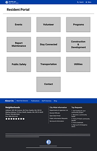
anding Page
Our design for the Landing Page clearly presents a diverse set of services (all indicated through interviews and tree tests) with title and description for clear identification.
-
Local feed allows the user to view selected local posts depending on the location they are in or want to look for. This feed allows the user to never miss out on local issues and events.
L


N
ext Steps.
Through observations from usability tests and interactions regarding our current prototype, we will focus on the following features moving forward with the design:
-
Investigate whether tabs would be a clearer rather than buttons to navigate between pages
-
Breadcrumbs need to have a clearer design and more consistent with the current website
-
Conduct further rounds of usability tests along with stakeholder evaluations
-
Continue to refine the user interactions and the UX/UI Flow
-
Interactive maps need to be built out

Final Thoughts.

hat I Learned.
W
I learned to respect the tedium of laying out a site map and performing a content audit during a website redesign. They may be the less glamorous parts of the UX design process, but they are there for a reason, and your work will be much better for it.
I also learned that language matters, especially when it comes to information architecture. I’ve always believed in the general value of the words we use, but it’s amazing how much a short round of card sorting or tree testing can reveal about the way people think about words and nomenclature. As UX designers, we are responsible for helping people make sense of the world, so specificity and clarity are more important than ever.
And I learned that designing for everyone has its tradeoffs, but we should still strive to delight as many people as we can. With its massive annual audience and near-infinite use cases, the Seattle website‘s information architecture will probably be a mess for a long time, but there will always be ways to make it better for every kind of advocate.
